 What's new?
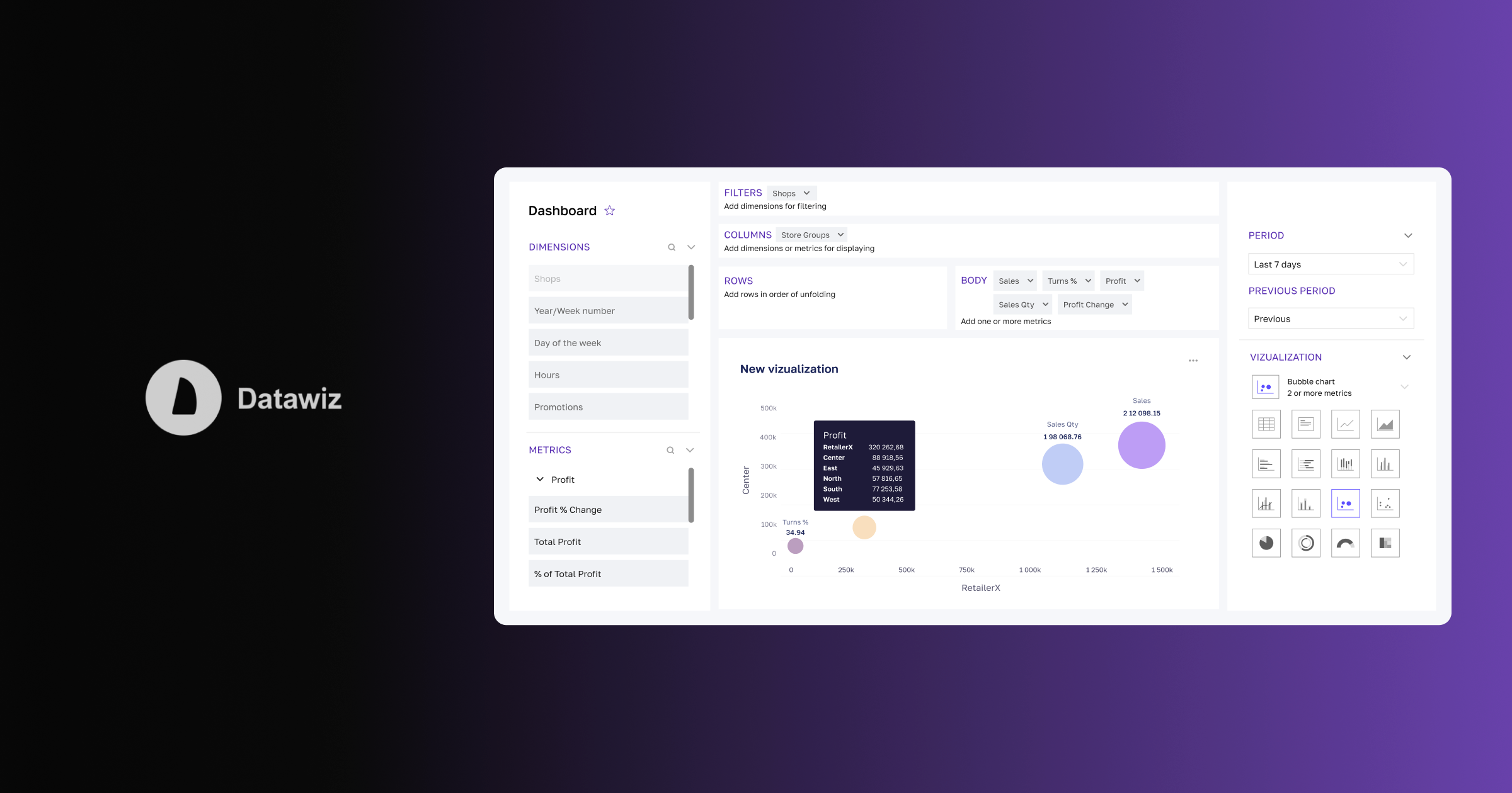

Dashboards: Alive Analytics on the BES Platform
A data-driven decision-making approach is vital for any retail because it allows you to avoid intuitiveness and reasonably choose development strategies. It requires the development of a huge amount of data and their presentation in a convenient and understandable format. Visualizations and dashboards are effective tools for these tasks.
Visualization is a graphical representation of data that helps visualize the past, present, and potential state of affairs in the chain.
Dashboardis an interactive information panel that can contain several visualizations and allows you to analyze data in real-time. By right, they can be considered "wise reports" that provide a "squeeze" of useful information in a minimal space. The user does not need to spend time and effort on data processing, identifying trends, and establishing their causes.

Goals and purposes of the dashboard
The main objective of a dashboardis to help users make informed decisions. To do this, it visually presents grouped data in an understandable format and with elements of interactivity.
The dashboard reveals:
✅ how business goals are achieved;
✅ what are the dynamics of indicators;
✅ comparison of metrics with each other, with indicators for other periods or planned values;
✅ regularities in important business processes.
What are the differences between a dashboard and a report?
• The dashboard contains a visual representation of information instead of a huge stream of numbers that are difficult to perceive and evaluate without first ordering them.
• Unlike tables, dashboards summarize the most important information which impacts the manager's decision. If necessary, you can figure out the details, descending from a higher level of data to the lowest.
• All information is presented on one panel - the user does not need to scroll through the pages with reports: the general situation is immediately visible.
• The data on the dashboard is grouped according to the necessary issues and interconnected - this allows you to get important insights for managers and leaders.

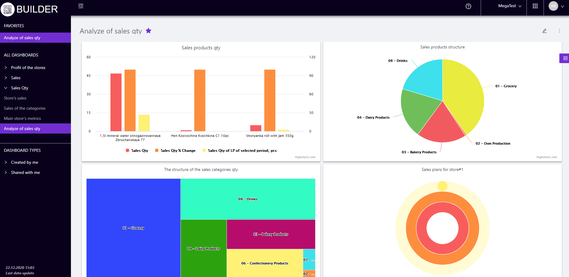
Dashboards from Datawiz
The BES analytical platform hosts a powerful and intuitive visualization and dashboard builder - Builder.
Dashboards can be created for each employee, taking into account their tasks and powers.
For example:
- for top managers – the solution helps create dashboards with key business indicators and their dynamics;
- for store managers - the solution helps create dashboards with indicators for their stores;
- for category managers - the solution helps create dashboards with visualizations of sales by categories and products.
The whole process of building dashboards consists of several clear steps:
Step 1 - Forming the necessary data sampling- the drag-and-drop technology built into the Builder allows you to quickly create a dashboard, taking into account the necessary dimensions and levels of data detail. It is enough to drag data from the panel to the desired block (filters, columns, rows) and filter by the required criteria.
Step 2 - Setting the display method - the user can choose one of 17 types of visualizations, taking into account the characteristics of the data sample and the purpose of the analysis. In addition, you can customize: the color of elements and labels, the style of the visualization title, turn on/off the axes and legends, sort data, etc. All this allows you to create unique data displays that are not only informative, but also aesthetically pleasing.
Step 3 - Placing visualizations on the dashboard - allows you to place the necessary visualizations on the dashboard and, if necessary, resize them, swap them, turn on filters, etc.
Note!The created dashboards and visualizations are easy to share with Builder users or using a link. This will allow establishing interaction with different levels of management, to increase the efficiency of analysis.
Builder is a powerful solution for efficiently completing chain business process tasks.
Dashboard features that are built with the Builder
Builder users have many options for creating and editing dashboards. Let's consider the most important ones.
1. Adding two or more dimensions.Two or more dimensions can be simultaneously placed in a table with selected data for visualization.
Dimension - criteria for selecting analysis data, represented by a general list: stores, categories, products, promotions, types of promotions, brands, category managers, suppliers, etc.
For example,if you select the "Categories" dimension in addition to the "Stores" dimension, the visualization will contain data on stores that expand to product categories.
2. Deployment of dimensions in the visualization. Adding several mutually agreed dimensions allows you to adjust their "failure" in the desired sequence.
For example, the data of sections "Brands", "Categories", and "Products" can be deployed: brands → categories → products.
3. Displaying elements without data- allows you to display all the elements of the selected dimensions for visualization, taking into account their zero values.
4. Adding 800+ various metrics to the visualization - a huge number of BES metrics and individually configured indicators allow you to create dashboards that visualize any business process on the chain. This will take into account all the specifics of the activity, identify weaknesses and make effective decisions.
5. Editing metrics on the visualization- the user can perform various actions with the added metrics:
- filter metric values according to selected conditions (more/less than, equal, between, etc.);
- edit the metric name;
- set the number of decimal places;
- delete metrics.
6. Formatting data display on the visualization - the user can create unique visualizations by choosing:
- type of visualization from 17 available ones;
- settings for the name of the visualization - font, placement, color and size of the inscription;
- the color of the elements from the proposed palette or create your shade;
- axes settings - turn on / off axes, set boundaries, scales, names, etc.;
- setting legend, trendline, data signatures, etc.
7. Distribution of dashboards - the Builder functionality allows you to share dashboards with other users or employees of certain roles in business processes, providing different access rights (available to view / edit). General insights and awareness of the chain affairs will allow you to make the most weighty and objective decisions.
8. Viewing the history of activity - a separate report "History of activity" allows you to track who, when and what actions were performed on the dashboard.
Turn your analytics into interactive, custom dashboards and charts with Datawiz Builder. Bring your data to life and make it understandable to every worker.
Make decisions based on real data with Datawiz BI


 No credit card required