

Last updated: October 3, 2026
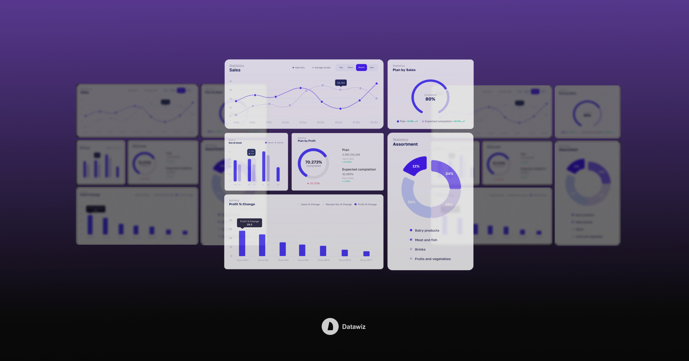
Data visualization is one of the most direct ways to turn raw numbers into something a team can actually act on. A chain's sales, inventory, and customer data mean little as rows in a spreadsheet, but the right chart can surface a trend, a gap, or an anomaly in seconds.
Building a good visualization still takes judgment: the right chart type, a clear layout, and colors that highlight what matters instead of distracting from it. There are many ways to represent the same numbers (diagrams, charts, schemes, tables, maps, interactive storytelling) and each one fits a different kind of question. Picking the wrong one is one of the most common reasons a dashboard looks busy but tells you nothing.
Top 6 Data Visualizations for Retail
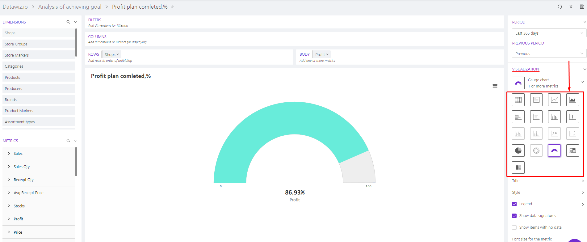
Most of these chart types are available in Builder, the diagram creator inside the Datawiz BI platform. It lets you design the look of a dashboard (colors, shapes, labels), choose from 17 visualization types, and configure every element: axes, legend, scale, and more.
Interactive dashboards built this way give retailers three concrete advantages over static reports:
- Real-time data. See up-to-date numbers and react to changes in the chain as they happen, instead of waiting for a weekly export.
- Faster analysis. Track sales, turnover, transactions, inventory, and supply chain metrics without building each report from scratch, which frees up time for the decisions that actually need a human.
- Detail on demand. Drill from the whole chain down to a single checkout counter, without losing the overall picture.
Choosing the right visualization still comes down to three questions: What type best fits this specific data? Does it actually describe what's happening in the chain, or just look impressive? Is one chart enough, or do two or three together tell the fuller story?
Research on retail dashboards shows that 85% of the charts retailers actually use are histograms, line charts, and tables. That's not surprising: these three show trends and patterns clearly, need little explanation, and make it easy to compare numbers or track how they relate. But several other chart types do specific jobs better. Here are six worth knowing well.
Tables
Tables are the most common way to display data: simple, familiar, and effective for almost any audience. Their main weakness is that the data stays in raw form, so patterns and anomalies don't jump out on their own.
When to use them:
- You need exact numbers, not an impression. For example, this month's exact sales value and its growth rate in percent.
- You need to sort indicators in ascending or descending order.
- You need to combine indicators with very different scales, or mix numeric and non-numeric values in one view.
How to build them well:
- Structure data from the highest level down: stores, then categories, then subcategories, then SKUs. That way the most important numbers show up first, with detail available on demand.
- Use multi-level columns to group related indicators, for example Profit, Sales Value, and Receipts Qty for the same products across stores.
- Add formatting: filter by a threshold (more than or less than a value), or set a fixed number of decimal places.
- If the table is large, add a search function so people can find what they need without scrolling.
Histogram / Column Charts
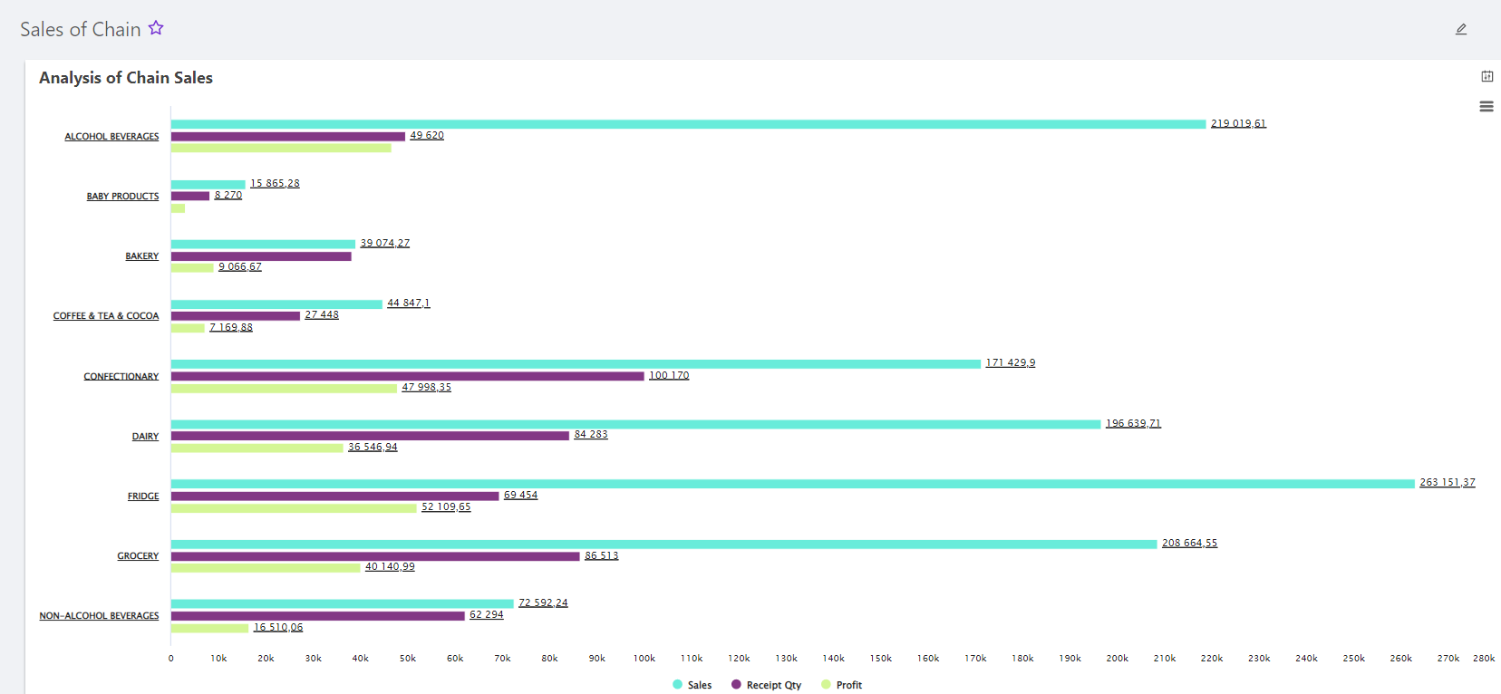
Histogram and column charts work best when you're comparing distinct, unrelated elements: different products, categories, or brands.
When to use them:
- You need to compare data across periods, such as sales dynamics over time.
- You need to show differences between dimensions: stores, categories, products, or category managers.
- You need to compare several indicators within one dimension, such as stock, one-day sales value, and order value across product groups.
How to build them well:
- Use horizontal bars when you have many categories, since they read better with long labels. Vertical columns work better with fewer categories, since they use space more efficiently.
- Order sections ascending or descending, not randomly.
- Break items into subcategories with separate rows when useful.
- Use a contrasting color scheme, and highlight the specific points that matter most.
Stacked Bar / Column
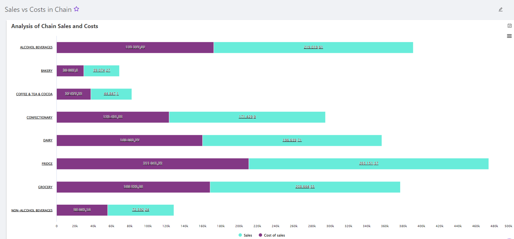
A stacked bar or column chart shows how individual elements contribute to a total. The height or length of each segment within the bar represents its share. This works well for illustrating how store sales break down by period, or comparing expenses against revenue.
A stacked chart looks like a standard column chart, except it also shows that shared, cumulative comparison within each bar.
When to use it:
- To spot trends and patterns over time (month, year).
- To compare two related quantities, such as supply versus demand, or ad spend versus sales from promotions.
- To compare individual parts against the total they add up to.
How to build it well:
- Order the parts of each bar ascending or descending for easier reading.
- Use a contrasting color scheme and highlight meaningful shifts over time.
- Keep it to around 10 parts or fewer. More than that, and the chart stops being readable.
Pie Charts
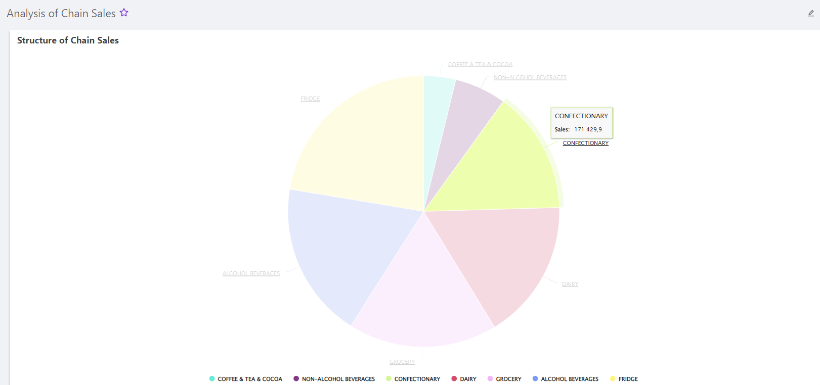
A pie chart compares parts of a whole by dividing a circle into proportional slices. It's built to show the structure of a metric, such as sales value, stock levels, or losses from stockouts, not to track how that structure changes over time.
When to use it:
- You have a complete set of parts that together make up the whole, summing to 100% or to the total value of the metric.
- You want to show the distribution or structure of a metric.
- You care about the current composition, not how it's changed over time.
How to build it well:
- Keep the number of slices limited. Analysts generally recommend no more than 8. Beyond that, the chart gets hard to read.
- Group small, less important slices into a single "Other" category.
- Label each slice with both its absolute value and its percentage share.
Treemap
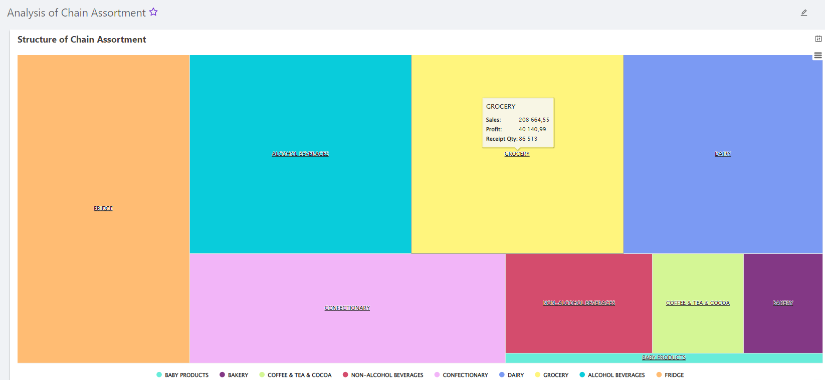
A treemap displays hierarchical data as a set of nested rectangles. It shows two things at once: the value of each individual data point, and where it sits in the hierarchy.
When to use it:
- You have a large dataset with a hierarchical structure.
- You want to show percentage contribution within a hierarchy, such as total store sales broken into beverages, groceries, dairy, and bakery, then further into subcategories like alcoholic and non-alcoholic beverages. This lets a category manager see what's performing well at every level at once.
- You need to study a large volume of data in detail, such as how product stock is distributed across suppliers.
A treemap serves a similar purpose to a pie chart but handles more complexity and more information at once.
How to build it well:
- Start from a properly built category tree. The treemap depends on it.
- Label each box with the category or subcategory name, its numeric value, and its percentage share.
- Avoid reusing the same color for unrelated boxes, or the hierarchy gets harder to read at a glance.
Gauge Chart
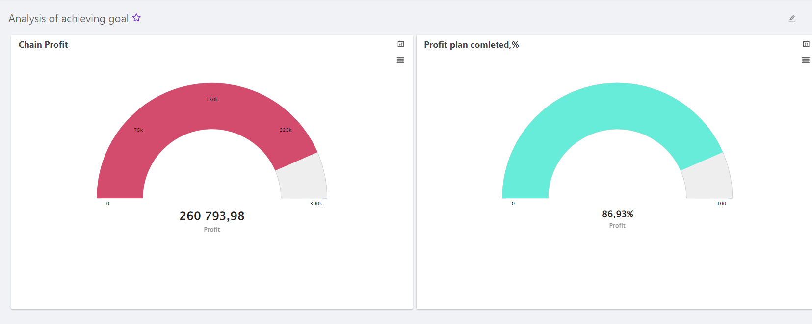
A gauge chart, often called a speedometer chart, measures progress toward a target. Its main job is showing how close a specific indicator is to a goal.
When to use it:
- You have a single, linear progression you want to track.
- You want a quick read on whether a goal was reached.
- You're tracking deadlines for hitting a specific KPI.
- You're comparing progress across a few objects on the same metric.
How to build it well:
- Make sure you've collected the right data before building the chart.
- Size the gauge to fit the full range of the data you're displaying.
- Switch to a different chart type if the underlying data is too complex for a single dial to represent clearly.
- Keep it compact. A gauge chart's whole value is in being quick to read at a glance.
How Retailers Use These Charts in Practice
The six chart types above rarely work alone. In practice, retailers combine several of them into a single dashboard built around one business question. A few examples built on Datawiz BI templates:
- Chain KPI dashboard. Column charts and tables track sales volume and transactions against targets, broken down by store and by the whole chain.
- Store performance dashboard. Gauge charts show progress toward store-level targets, while column charts compare cashier efficiency during peak hours and performance by product category.
- Category management dashboard. Treemaps and tables break down SKU-level turnover by category, rank categories by sales, and flag where inventory needs adjusting based on performance trends.
- Marketing dashboard. Pie charts and stacked bars break down loyalty program data, profit by segment, and demand for promotional items.
- Supplier collaboration dashboard. Tables and column charts track supplier effectiveness through category sales reports, delivery timeliness, and stock levels.
None of these dashboards need a new chart type. They just apply the six above to a specific question, which is usually the harder part.
Choosing the right chart isn't about picking the most visually interesting option. It's about matching the shape of the question, a comparison, a trend, a structure, a target, to the chart type built to answer it. Tables, histograms, and line charts cover most everyday needs, while stacked bars, pie charts, treemaps, and gauge charts each solve a narrower problem especially well.
FAQ
What is the basis of any chart?
Every chart uses graphical elements to represent relationships and patterns in a dataset, whether numeric or categorical. The chart type you choose determines which kind of relationship it shows clearly, and which kind it hides.
What is a histogram?
A histogram is a bar chart used to show the frequency distribution of numerical data. Consecutive value ranges, called classes, sit along the horizontal axis, and the height of each bar reflects how many values from the dataset fall into that range.
What is a pie chart?
A pie chart represents data as a circle divided into sectors, where each sector's size reflects its share of the total. The full circle always equals 100% or the total value of the metric being shown.
What is a treemap?
A treemap represents hierarchical data as a set of nested rectangles. Each rectangle stands for a category or a node in the hierarchy, and its size reflects its value relative to the total.
What about line charts and scatter plots?
Line charts and scatter plots are two of the most widely used chart types, alongside the six covered here. A line chart tracks a value over time, such as daily sales across a month, and is the standard choice for trend analysis. A scatter plot shows the relationship between two numeric variables, such as ad spend against sales, and is the standard choice for spotting correlations or outliers. Both are available in Builder alongside the chart types above.

Make decisions based on real data with Datawiz BI



 No credit card required